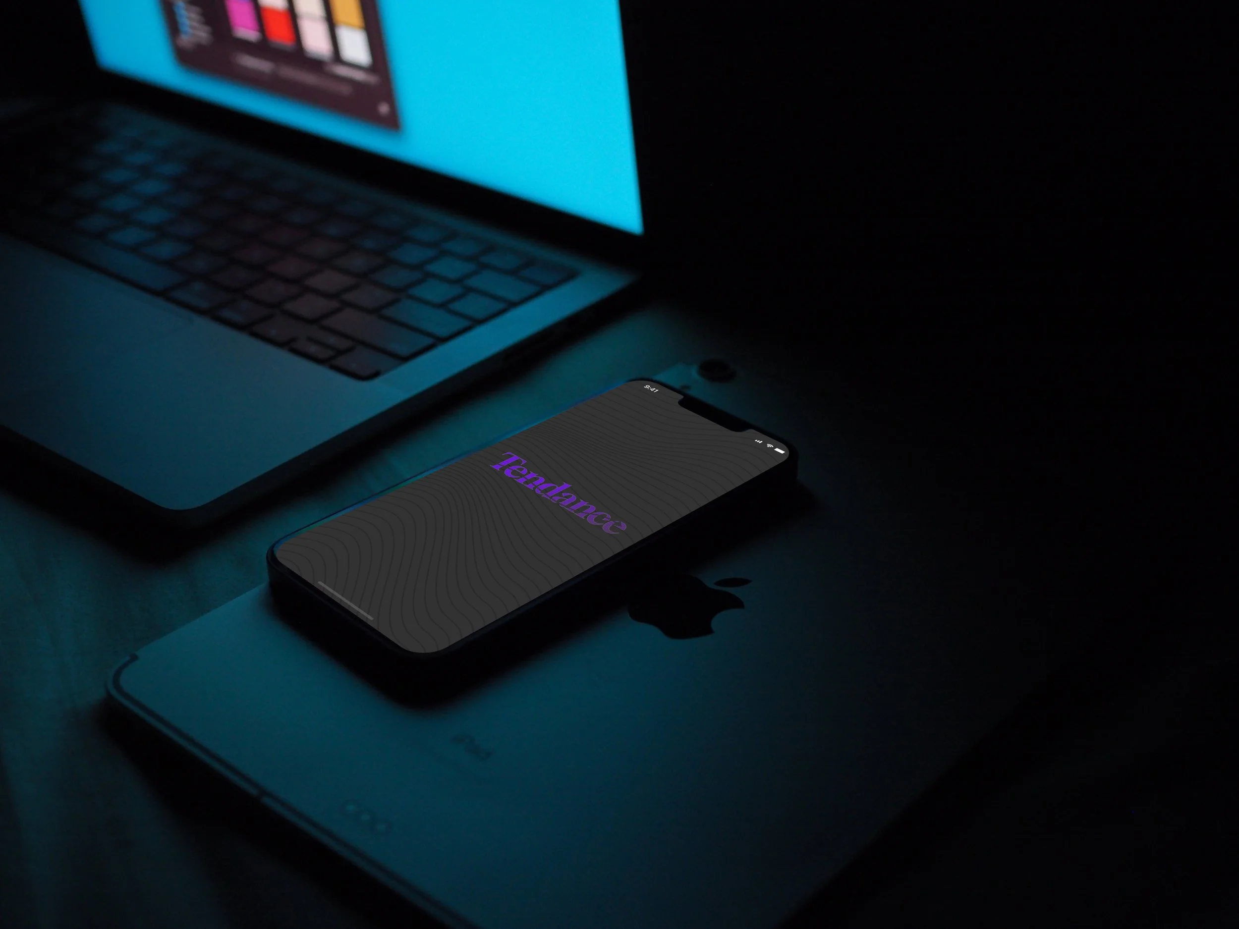
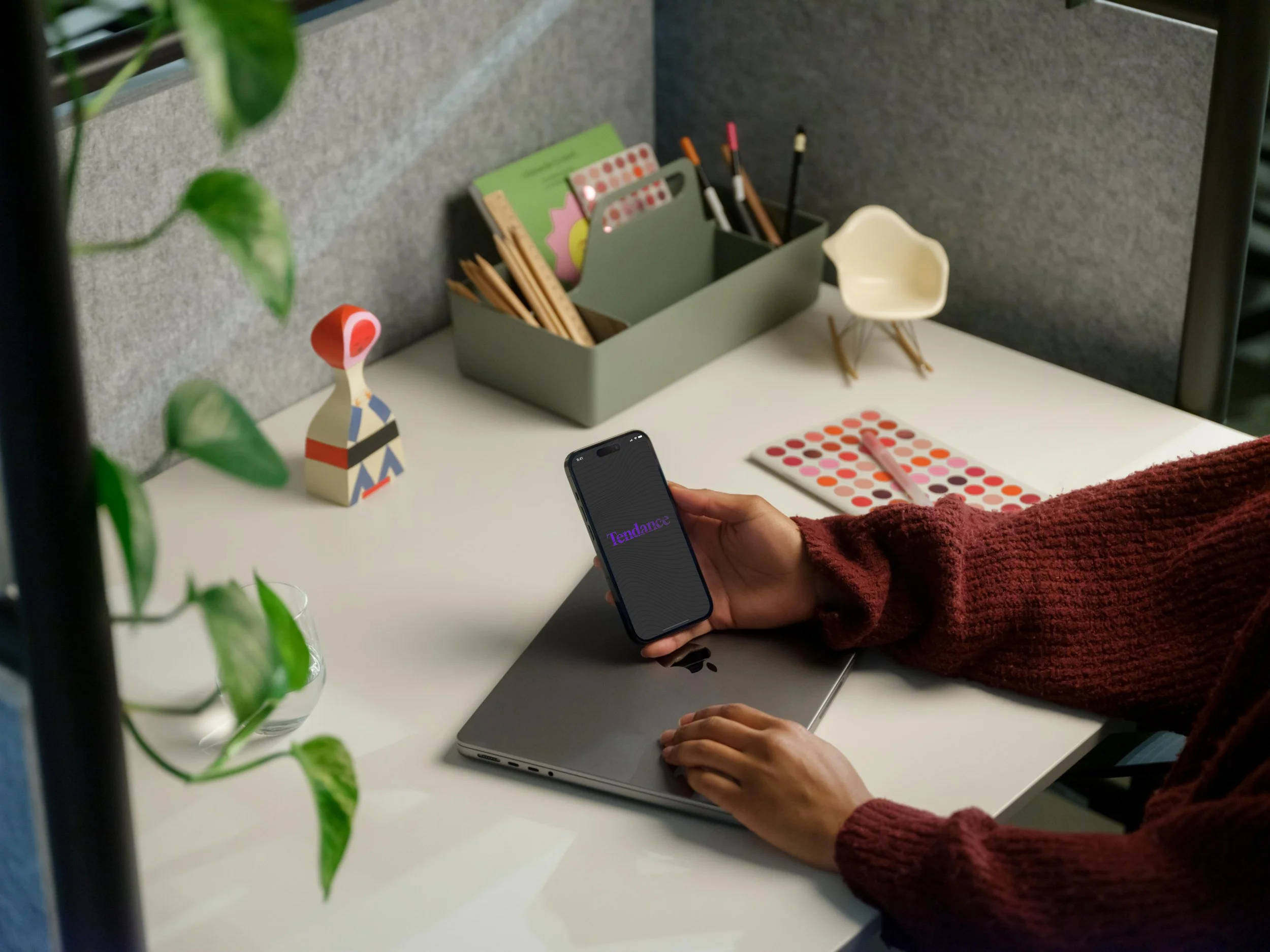
School Management App
Many traditional school teachers face unique challenges as they navigate their days. In some schools the challenges surrounding student attendance and movement throughout the school can present overwhelming safety concerns and challenges for teachers, administrators, and security staff. There is a significant amount of pressure put on teachers to manage their classrooms (sometimes with extreme student behavior). Keeping track of students is paramount to ensuring safety and improving academic success. Tendance provides a solution to these problems in the form of a digital application.
The goals:
To assist teachers with remembering deadlines, important tasks, and improve communication amount staff
To improve school safety and teacher time management by providing a tool that compiles attendance and movement of students throughout the schoolday

Roles
User Research
UX/UI Design
Prototyping
Usability Testing
Tools
Figma
FigJam
Otter.ai
Google Docs
Optimal Workshop
Project Duration
April 28th - May 27th
100+ hours
Research & Planning
Research was conducted to better understand the needs of my target audience, to gain insights that would help form/confirm hypotheses that could later be accepted or rejected based on more research. A Research Plan was created with the following objectives.
The Research Objectives (later used to formulate Interview Questions):
Understand the day to day processes for a teacher
Understand what a “good/bad day” looks like and pain points in each
Understand target user needs and preferences with regard time and task management
Determine which present solutions already work for teachers and how those can be improvised on
Understand feature prioritization from the teacher’s standpoint
Surveys
A 7 question survey was sent to teachers around the district to gain some baseline qualitative and quantitative data. The 10 responses that were received provided me with with some valuable insights that I later sought to confirm though user interviews. Of the 10 participants, 8 responded that on a scale from 1-10, the challenges faced through the day were above a 6. 80 percent also listed managing student behavior (including student movement throughout the school) and remembering tasks/deadlines as one of their most time consuming activities. Considerations for the market were also recognized as I found that 90 percent of responders use technology in their day to day operations to simplify and improve certain processes.
Competitive Analysis
Three different apps were compared for pro’s and con’s. Through this analysis we were easily able to tell what worked well for certain local companies and what didn’t work so well. Through comparing E-Hallpass, Microsoft To-Do, and Monday.com, we determined that while there were a number of companies that specialized in tools that met a portion of my goals, no tool met both goals in it’s entirety. E-Hallpass came close with student monitoring capabilities, but required each student access to a communicating device and offered no other functionalities to assist teachers with other attendance or administrative tasks.
User Interviews
Following the competitive analysis, I needed to gain more specific insights through interviews. Using the Research objectives from the User Research Plan, I determined what information was a priority within the project and then transformed those research questions into interview questions via an Interview Discussion Guide. The target audienece for these questions were teachers in schools that allowed unsupervised student movement such as US middle and high schools.
POV and HMW Statements
While considering insights from the surveys and the competitive analysis, comments and responses from user interviews were compiled into four main insights two of which included issues with managing attendance task and other, and remembering deadlines. These insights were then transformed into 3 POV statements and then HMW questions to help me try to better understand my target users needs and goals.
Persona Profile
This persona profile was created using the 3 HMW questions that were created as a result of research from the competitive analysis, the surveys, and the user interviews. Mr. Jordan, a science teacher in Miami, has goals, needs, frustrations associated with teacher related administrative tasks. Mr. Jordan is who I referred to for assessment of potential solutions.
Idea Generation
Storyboard
To kick off Idea Generation, a story board was created to better imagine the tool that I was creating by imagining the solutions to the problems and goals faced by the Persona by visualizing the capabilities of relief experiences by the user after use. The solutions were based on three main themes; managing distracting calls, compiling attendance data by managing student movement, and providing a tool to compile reminders against a calendar.
Goal Diagram
Next, User goals (by way of the persona profile) was compared against the perceived business goals, with metrics also considered. Six shared goals were the result of this comparison; a mobile application, good ui designs, modular dashboard and features, quick tasks, simple and easy to understand design, and fast and effective support teams.
Information Architecture
For the first part of this phase, I set out to refine the architecture of the product that would serve our users and business. Through considering the storyboard problems, solutions and the goal diagram, I designed a user-flow based on the main proposed features of the app and then organized those features onto an empathy map to determine how the value of the feature compared against the amount of work required to produce that feature.
Step One
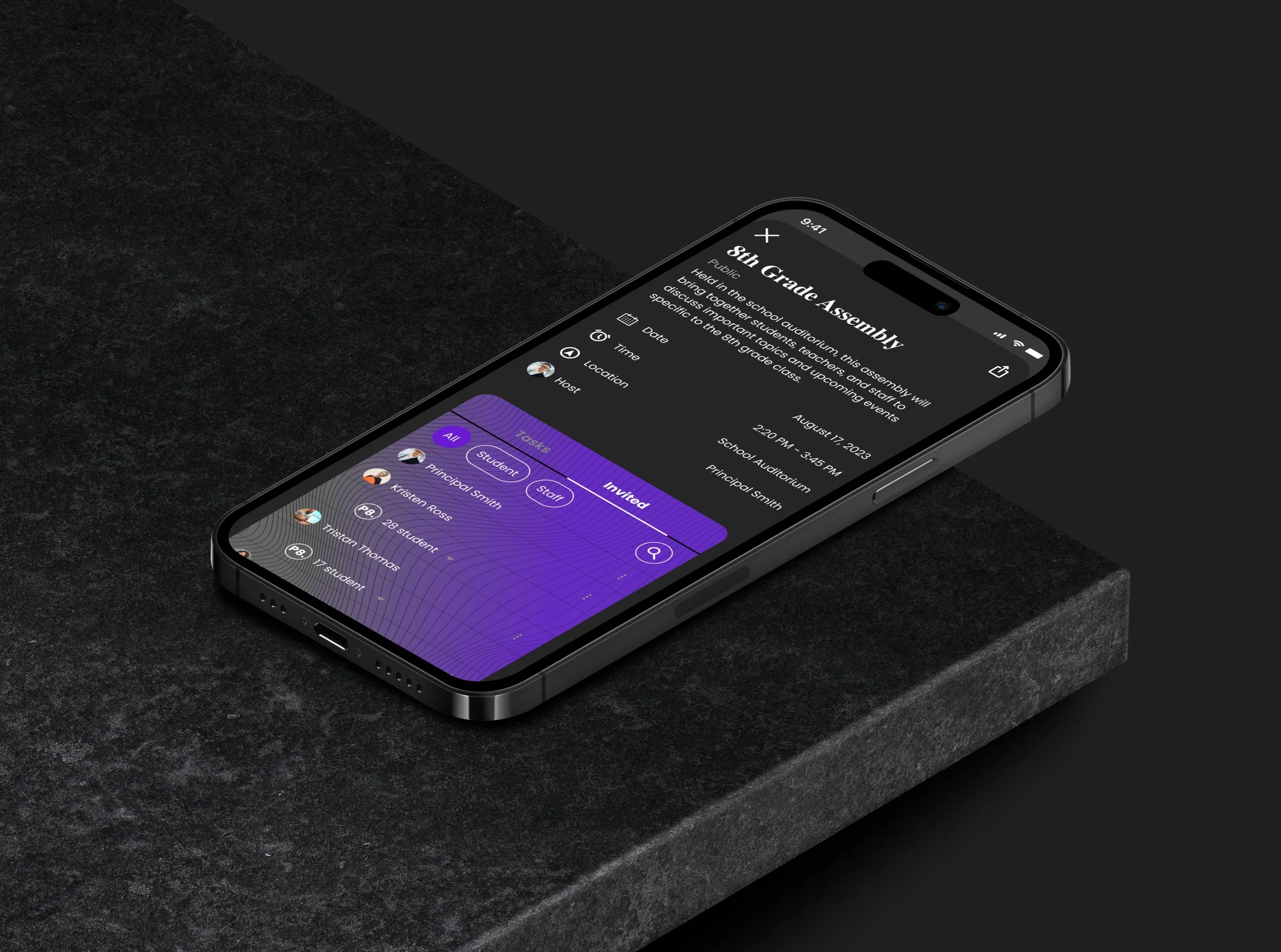
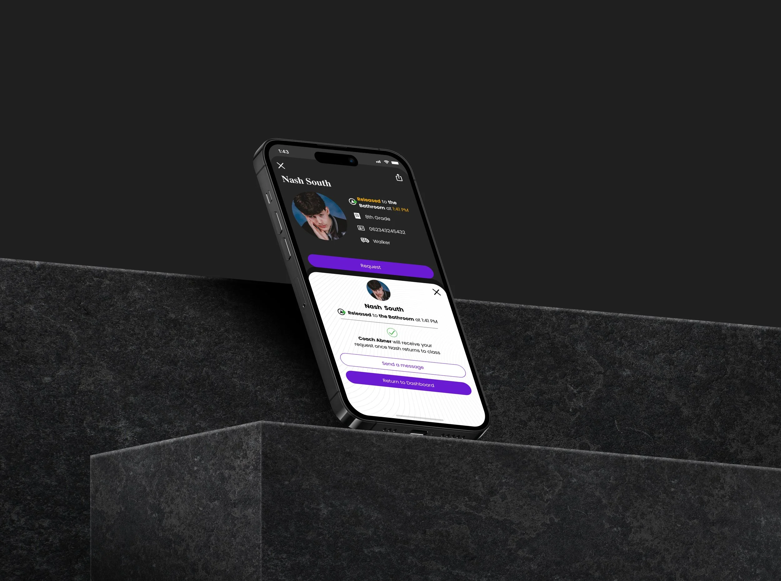
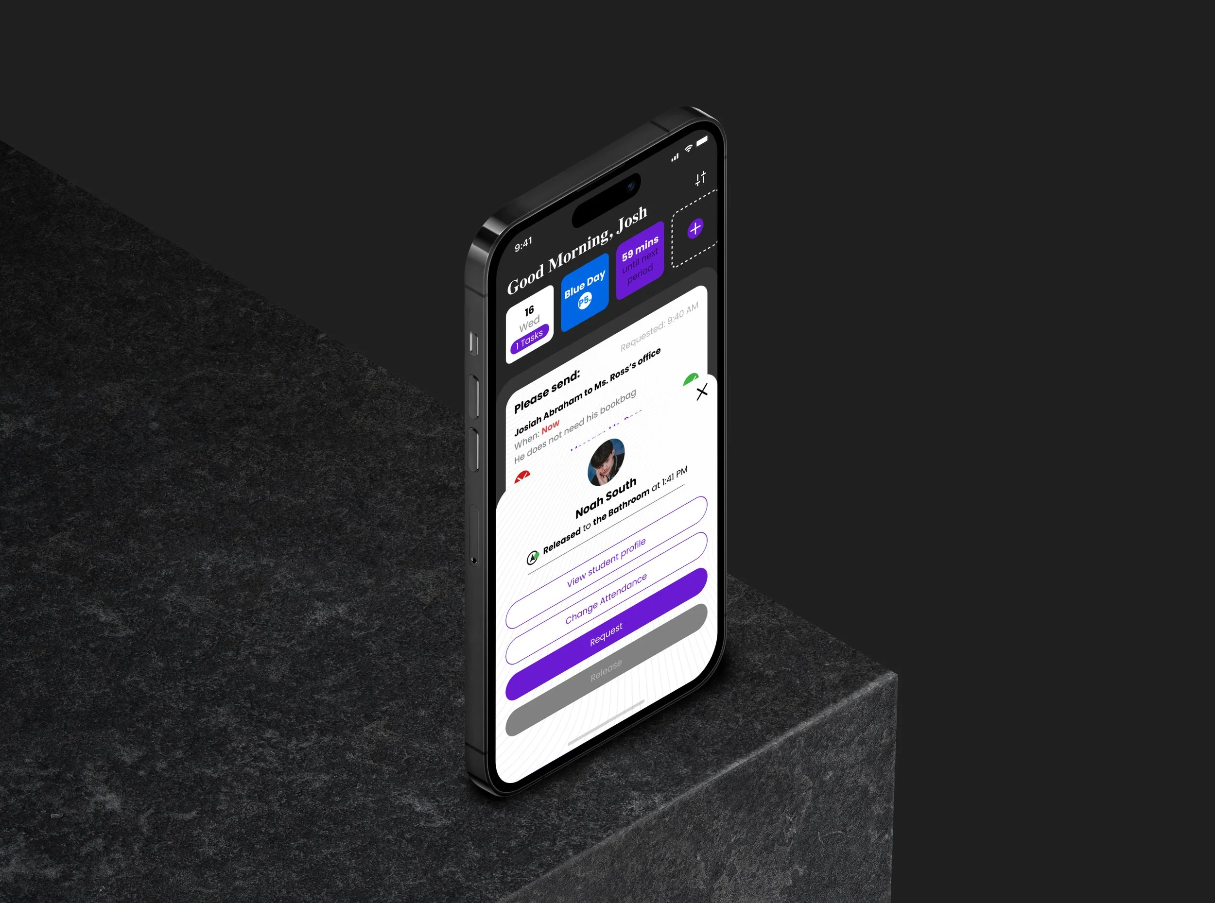
The 3 tasks mapped out in this User-Flow were (1) releasing a student to an administrator at request, (2) requesting a student from another classroom to your class, (3) view event details page from the calendar.
Through the empathy map, I was able to eliminate the digital whiteboard and lesson planning integration features from this first round of designs due to its lower user value and higher effort to implement.
With a narrowed down feature list and a better understanding of the specific pages and actions required to utilize those features, I began the process of narrowing down how these features would actually be organized. A mood board was created to start conceptualizing how the brand would look.
Step Two
3 participants participated in the Card-Sort; 2 sorted the cards into 6 categories while one user sorted the cards into 7 categories. All three users agreed on about 50 percent of card categorizations.
Cards were created based on brainstorming 40-50 keywords related to each of the three task flows.
Through analysis and understanding of the persona profile, these 5 brand themes were the creates before a mood board was created.
Support/Assistance
Attention
Progress
Security
Prioritization
Brand Idenity
After exploring some inspiration and drafting the 5 brand themes, I began to build the visual design by imagining a name, logo, colors, icons, and styling designs for the product. The result of these imaginations was this branding document.
Lo-Fi Wireframes
Eight screens were designed with the intention to be able to facilitate the tasks outlined in the task flow. Details from the information architecture phase were critical in deciding how this information could be best organized. GIven that the idea for a digital whiteboard and lesson plan integration were eliminated from the proposed feature list after conducting the empathy map, the most important feature to document became the releasing and requesting of students from classes as well as reminders from a district, school, and personal calendar.
Sketches
Lo-Fi Wireframes
UI Kit
The Brand Values generated for the mood board were combined with the components from the wireframes to create a UI kit. Included in the kit were the colors, typography styles, and logo already decided upon during the branding phase.

Minimum Viable Product
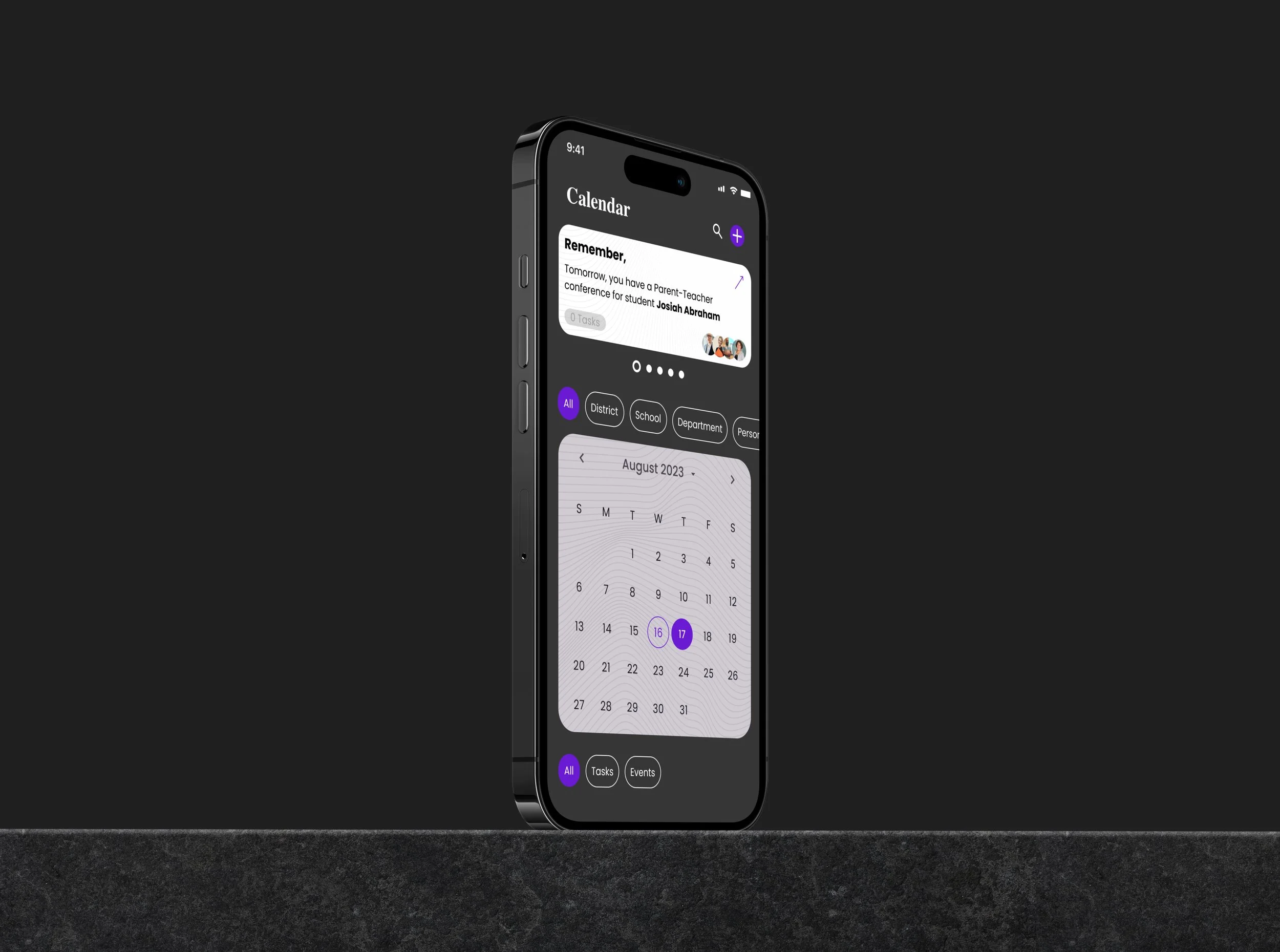
Tendance is a mobile application that gives teacher, administrators, security staff ease in monitoring student attendance and associated data while also providing a space to collaborate, and various calendar accessibilities with the potential to assign associated tasks.
Release Requests + Camera
Once on the dashboard of the application, Teachers can swipe left to access the camera with which they can use to scan student’s ID Badges to release them for bathroom usage, administrative calls, or other extracurricular engagements. Alternatively, requests for students can be sent by administrators or other teachers.
Calendar & Reminders
I also outfitted the application with a Calendar, which can include events and potentially related tasks. Reminders can be sent by Event Hosts to remind those involved of tasks that need to be completed. These reminders will appear on the dashboard.
Keep in Touch
A messaging function was included into the functionality to allow for communication between staff to prevent mistakes regarding student movement and for other general collaborative purposes.
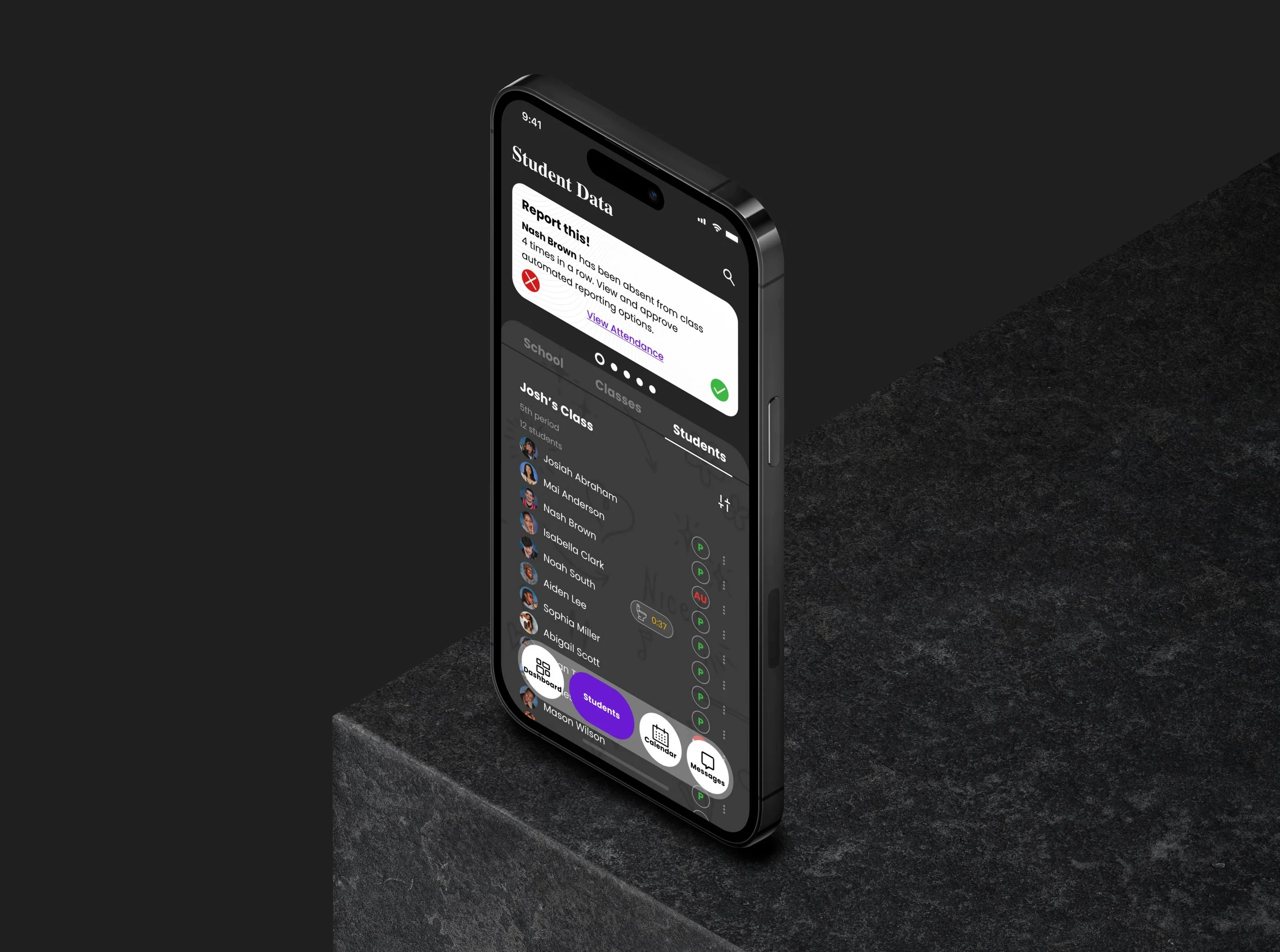
Compilation of Useful Data
School-wide data will be compiled to identify students who abuse bathroom privileges, students who spent egregious amounts of time outside of the classroom, and other class, teacher, or student specific trends in data to allow administrators to continually improve their school.
Data regarding individual students will be found on their Student Details Page. This page will contain information regarding their current location, ID number, mode of transport, schedule, attendance data, and home contact information.
Live Student Attendance
The app was also outfitted with full functionality for teachers to quickly take attendance at the start of every period. Teachers can do this by manually clicking the drop down menu to change each students status to present, tardy, or absent. Alternatively, teachers can use the camera function to quickly mark students in.
Important Student Info
Usability Testing
For the Usability Test, I created a functional prototype and had participants complete four different tasks; three directly related to the task flow.
User Testing Tasks
View Messages Page
Determine which staff members have been invited to a specific event.
Release a student to an Administrator.
Request a student from a Class.
-
Evaluate the experience of users while completing a specific task to help identify pain points within my task flow or design.
-
3 Users were interviewed
2 male, 1 females
all 3 meetings in person
-
Task Completion Rate: 50%
Average number of Users that made Error:
Find unread message - 3/3 Users
View Event Page - 3/3 Users
Release Student - 0 Users
Request Student - 0 Users
Average time to complete tasks:
Find unread message - 1 min 48 seconds
View Event Page - 1 min 15 seconds
Release Student - 33 Seconds
Request Student - 45 Seconds
-
Average overall user Satisfaction: 8.25/10
Noticeable Frustration by users: 6 out of 12 (each user were confused with the 1st and 2nd task)
-
All insights from the User Testing Interviews were compiled into a feedback grid. This helped to better visualize the changes that users want to be made, questions that they had throughout, and ideas that they came up with. This also provided me with positive feedback as to what was working well.
These cards were further organized into three main take-aways:
addition and subtraction of certain copy can improve “time to complete task”
addition and subtractions of certain components can improve usability
Updates to the overall design can help users navigate!
Through testing I found that all participants had some issues finding the Unread messages in the message page when asked as a pat of the usability tests. To fix this, these two iterative changes were made:
Take Away 1a: add navigation names under icons
Take Away 2e: make message card on dashboard clickable
Iterations for Task 1:
Issue
As noted above, the messaging card included no indicators that clicking it would take users to the messages menu. Users also either didn’t look at the navigation menu or did not understand the icon to mean “student”.
Iteration
To fix this, an arrow was added to indicate click-ability. The name of each navigation button was also added below the icon. Further testing could be conducted to see whether these changes eliminate the confusion and pain points in this first task.
Conclusion
Was the project successful?
The research produced valuable insight about our target audience and even about the potential features that they found valuable. These were built into sketches, lo-fi wireframes, and then a hi-fi. These wireframes were tested with our target audience and then appropriate changes were made. Although some tasks proved to be difficult or impossible for some users, valuable insight was gleaned to eliminate these pain points. Thus, I deem this project was a success.
What can be improved?
There are a number of additions I would make moving forward; before and after completing more user tests. Firstly, I would conduct another round of user testing to verify that the above iterations eliminated the pain points experienced by previous users that prevented them from completing tasks 1 and 2. Based on the feedback, I would either continue to iterate for those two tasks or I would complete all of the remaining suggested iterations (take aways) based on user-testing and follow that up with another round of testing.
Lastly, there were a number of feature ideas that were not included in this round of designs due to time and project constraints. Taking time to plan these designs with the support of user research could prove to be valuable for our target audience. These designs include but are not limited to a whiteboard feature and lesson plan integration.
What did I learn?
“User mistakes do not mean a failed project!”
During the user testing phase, I identified tasks 3 and 4 as the most important from their empathy map. Tasks 1 and 2 (finding the messages and event page) was purposefully placed first in the prototyped user testing sequence in an effort to ease users into the conceptually more complex task of releasing and requesting students.
I was very surprised to find that all three users had issues completing what I deemed to be the easier tasks and no issues at all completing what I thought were more difficult tasks. As a designer it’s important to remember that iterations are an important process in refining the uability. Bad insights do not mean a bad product, they are simply indications of changes that could improve usability.
To correct the major pain points within the first two tasks, very small (but impactful) design changes were made. With more time, I would run another usability test to confirm their success.