
Responsive Website Design
Allen Dental has been successfully running since 2003. Most of his clients discover the business through word of mouth or from google searches. Dr. Allen knows that taking a personalized approach creates positive doctor-patient relationships. His entire team understands that their client’s oral health is important; so they seek to create patient interest in self-care and oral care. This year, Allen Dental sought a company-wide branding refresh, including the website; as issues with navigation, visual layout, and scheduling were present.
The goal:
to increase acquisition and loyalty metrics by pinpointing usability problems for target customers that can be resolved with changes to navigation or visual design.
Roles
User Research
UX/UI Design
Prototyping
Usability Testing
Tools
Figma
FigJam
Otter.ai
Google Docs
Project Duration
April 2nd - May 2nd
100+ hours
Research & Planning
I conducted research to better understand the needs of our target audience, to gain insights that would help form/confirm hypotheses that could later be accepted or rejected based on more research. A Research Plan was created with the following objectives.
The Research Objectives (later used to formulate Interview Questions):
Understand target user needs and preferences with regard to dental visits or dental resources
Determine what the different reasons are that our users visit a dental site
rank them from most common to least common
Determine what new users look for on a dental site that will capture their attention
Determine which features would keep them coming back
Gather feedback on current visual design
Understand information prioritization from the user’s standpoint
Keyword Research
Keyword research was done primarily to understand what interests the current target audience had, the trends behind those interests, potential competition in the area, and even to better inform copywriting decisions later-on in the design process.
One of the main insights that were uncovered helped confirm the need for a responsive website; dental related searches remained rather consistent between April 2022 and March 2023 with total dental related searches at 6 million and mobile related searching staying at 3 million.
Competitive Analysis
The advantages and disadvantages of 3 different Dental companies in the area were compared against the current advantages and disadvantages of Allen Dental.
Through this analysis, I was easily able to tell what worked well for certain local companies and what didn’t work so well; All three companies except Allen Dental had some form of online scheduling, and some information about prices and services on the homepage. These initial insights (and others) were the first makings of my hypothesized findings which I sought to confirm further during Interviews.
User Inteviews
Following the competitive analysis, I needed to gain more specific insights through interviews. Using the Research objectives from the User Research Plan, I determined what information was a priority within the project and then transformed those research questions into interview questions via an Interview Discussion Guide. In an effort to gain the most insight, I chose to interview individuals that had varying different experiences on the spectrum from positive experiences to very negative experiences at a dental office. I aimed to keep all other characteristics varied as well including age and frequency of dental visits.
Affinity Map
For this affinity map, I was able to organize insights from each user interview into two categories; people that have had overall unpleasant experiences with dentists and those who have had positive (productive) or neutral insights with dental providers. These two groups would eventually become my two persona profiles.
Themes:
Mood when visiting (positive vs negative experiences)
Booking (online or phone) (positive vs negative experiences)
Website copy/design (positive vs negative experiences)
Features of the Site (positive vs negative experiences)
Personas
These two Personas were created based on the positive vs negative insights from each of the four dental themes found from affinity mapping. One persona served as the individual that was more or less unhappy with their past dental experiences and the other had mostly positive experiences.
Idea Generation
The goal of this phase was to create big picture solutions to the problems faced mainly by Abraham’s persona and to find ways to incorporate the positive attributes that Stacy appreciates in her persona.
To do this, I revisited the insights from the affinity maps, user interviews, and competitive analysis to compile a comprehensive list of suggested features/solutions. By comparing these against my two personas, I was able to determine which solutions/features were most beneficial to my target user and how much effort it would take to implement each. This was translated into an empathy map for visual application. Two important features were characterized in the “low effort to impliment” and “high user value” coordinate of the matrix; copy about “comfort and care” and friendly photos with smiling.
Information Architecture
Considering the insights from the feature matrix, I determined that another one of the most valuable features would be the ability of users to seamlessly schedule an appointment online. This also aligns with the business goal of attracting new customers and building loyalty with existing customers. So even though this feature required a bit more effort to create than the others, it proved to be the most beneficial for both user and business goals.
By creating a site map, I was able to determine the hierarchy of information; which pages and pieces of information related more closely and which elements took higher priority. This helped to prevent areas of overlapping content which had been plaguing the original website making navigation very confusing for users.
Given that the most crucial and important task involved scheduling an appointment, a task flow was created to model the exact steps that a user would take to complete the task. This helped to expound on the insights from the site map by visually representing the key pages associated with this task based on the site map.
Lo-Fi Wireframes
Starting with Homepage desktop designs, wireframes were created to showcase the spotlight feature “Scheduling an Appointment”. A service page and service example page were also designed to accompany this. As seen below, the last five screens involve a modal scheduling system.
“Graceful Degradation” was the design method chosen to create this responsive design. The reason for this is that our fancier features may not be fully integrated with older browsers which may be what a good number of my target audience is using. This could cause failures in the system that the business cannot afford. Conversely, these fancy feature may be specifically what is catching the attention of the more technologically up-to-date users. Thus, graceful degradation is the only way to ensure that both kinds of target users have access to the same information.
A good example of this lies in the “service cards” on the homepage or service page. Conceptually, desktop users will find that the “hover” state of these card will reveal overlayed details about that service. Given that hover states are not available on mobile, these “hover state” card will serve as the “active” state card on mobile, representing the service info without having to hover.
UI Kit
Visual design was formulated by comparing the current brand values with the data from Persona Profiles. As you may recall from research, many users prioritized calming and comforting copy and designs. Colors, fonts, Icons, and Card Styles were created with these 4 Values in mind.
Comfort
Education
Care
Trustworthiness

Minimum Viable Product
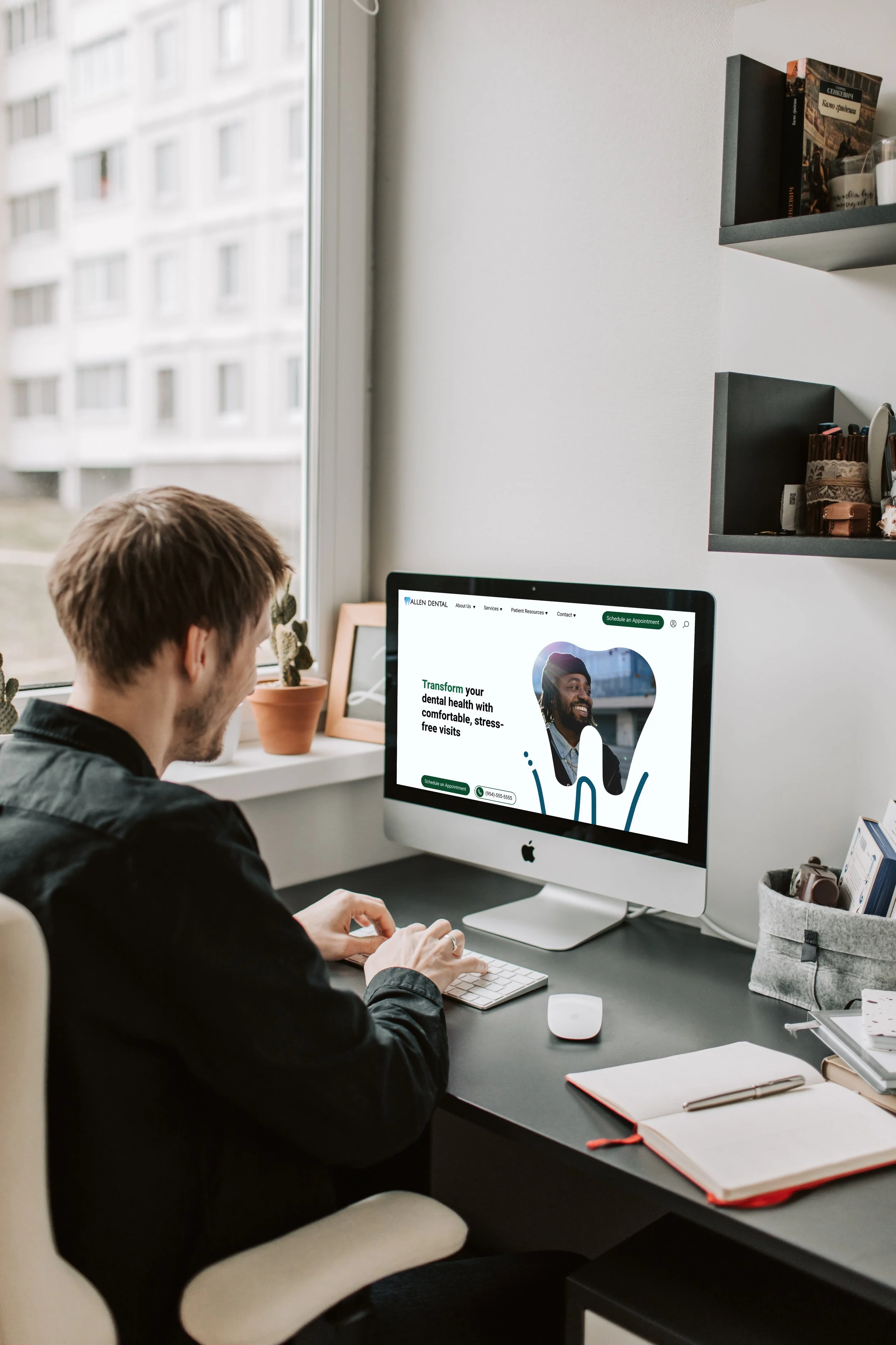
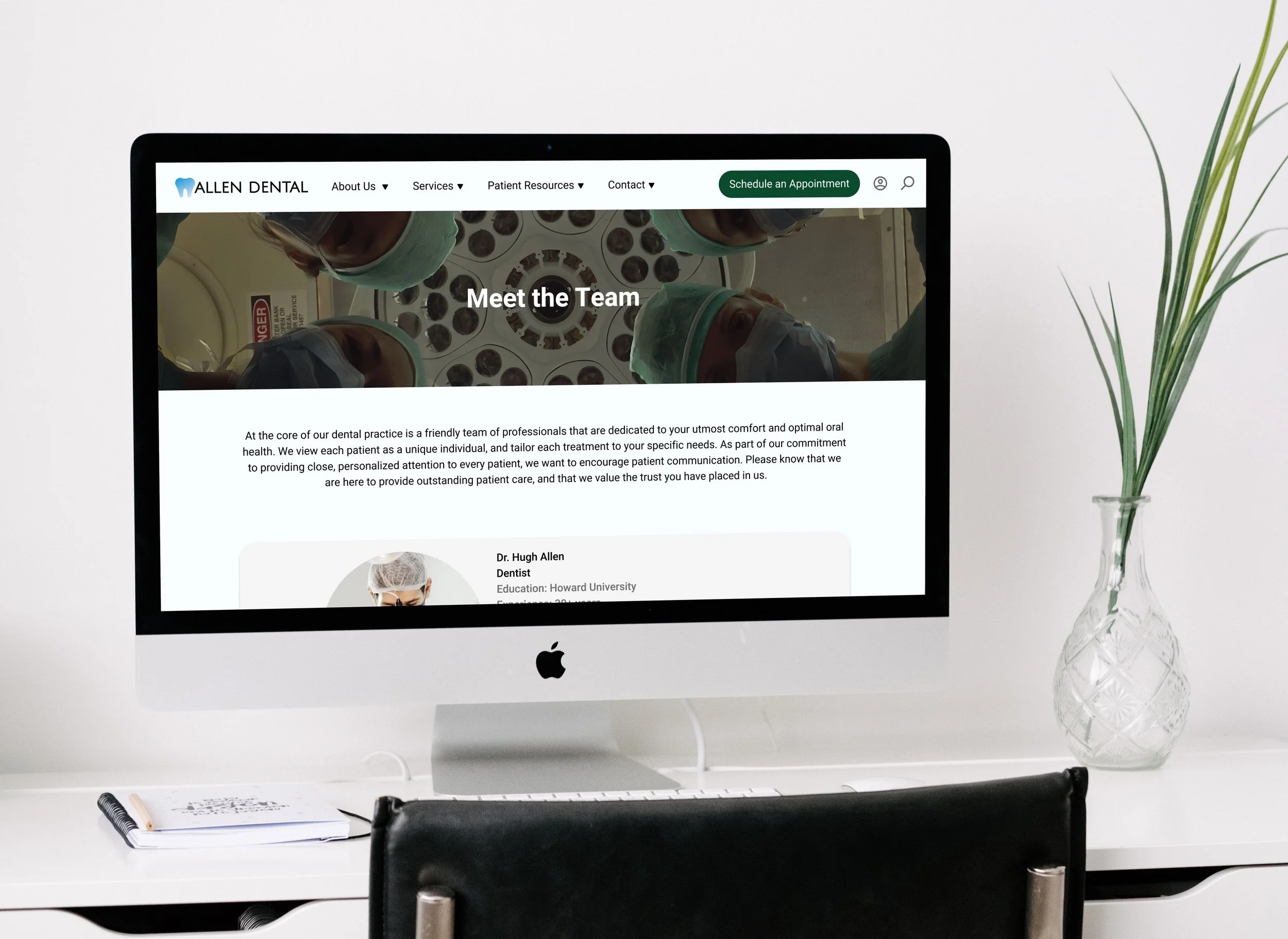
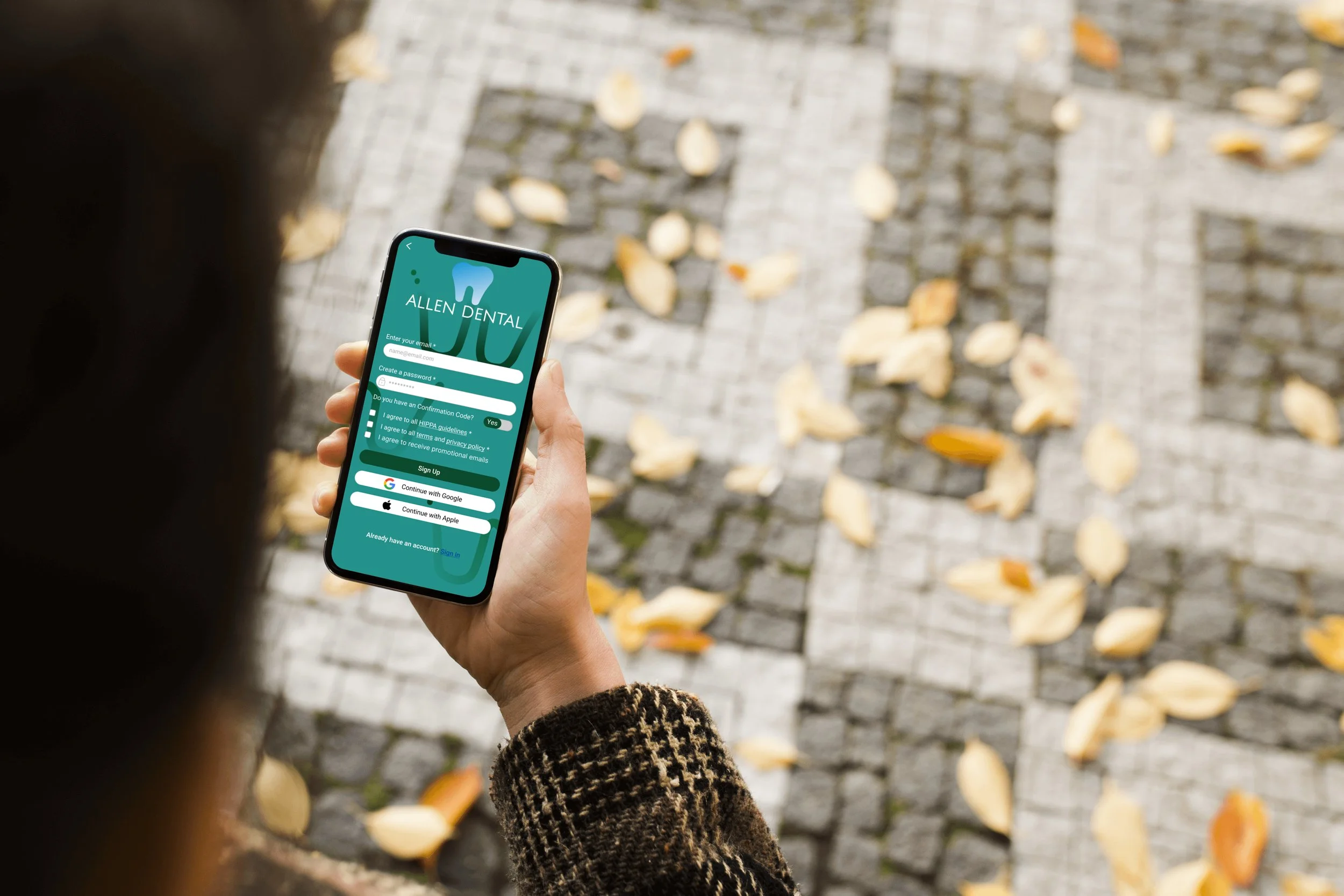
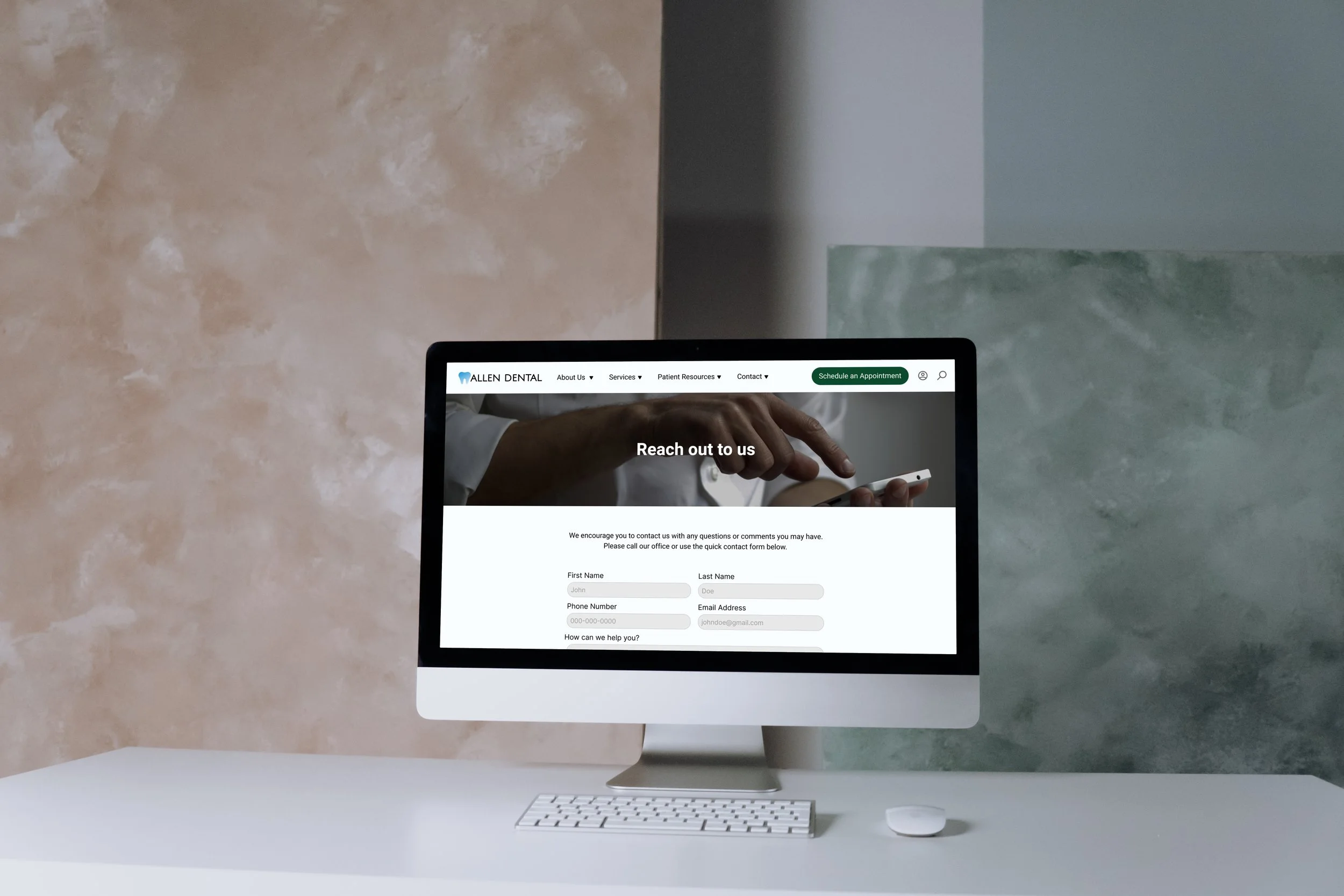
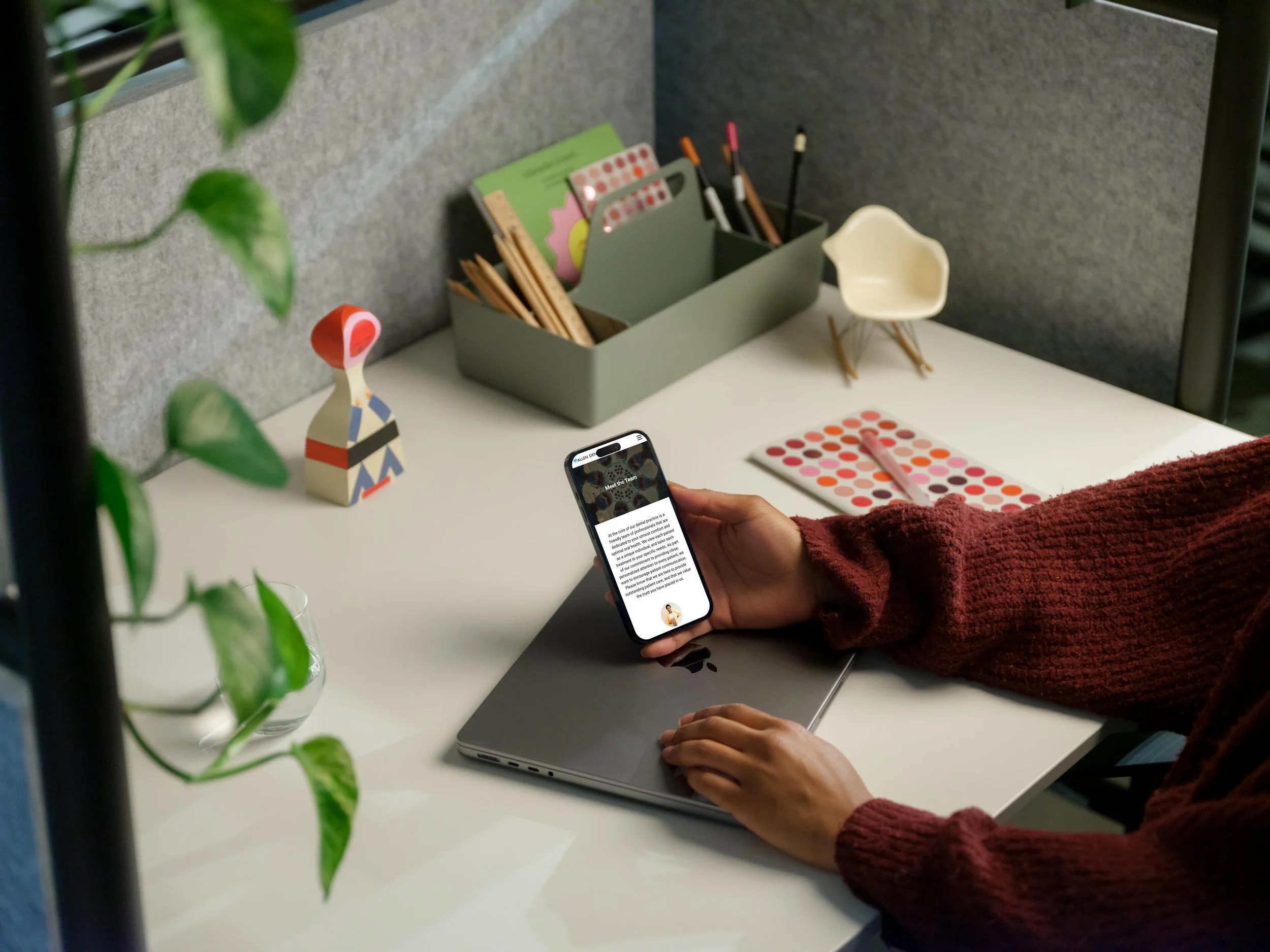
At Allen Dental, the staff understand that how to make patients feel is as important as the treatment they receive. To best serve visitors of all ages, Dr. Allen and team have created a family dentistry environment where patients are comfortable and confident with their care. To accompany this physical environment, I’ve rebranded his online environment as a mirror. Thus, his website exemplifies his friendly and gentle approach to dentistry, and his ability to meet the full range of his patients’ needs.
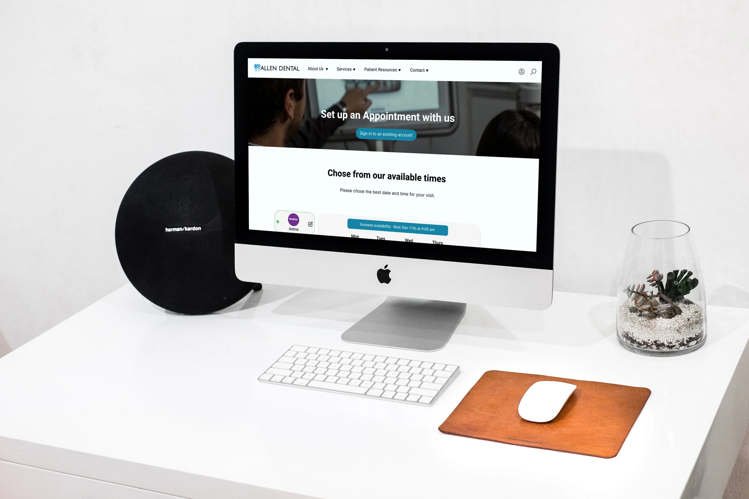
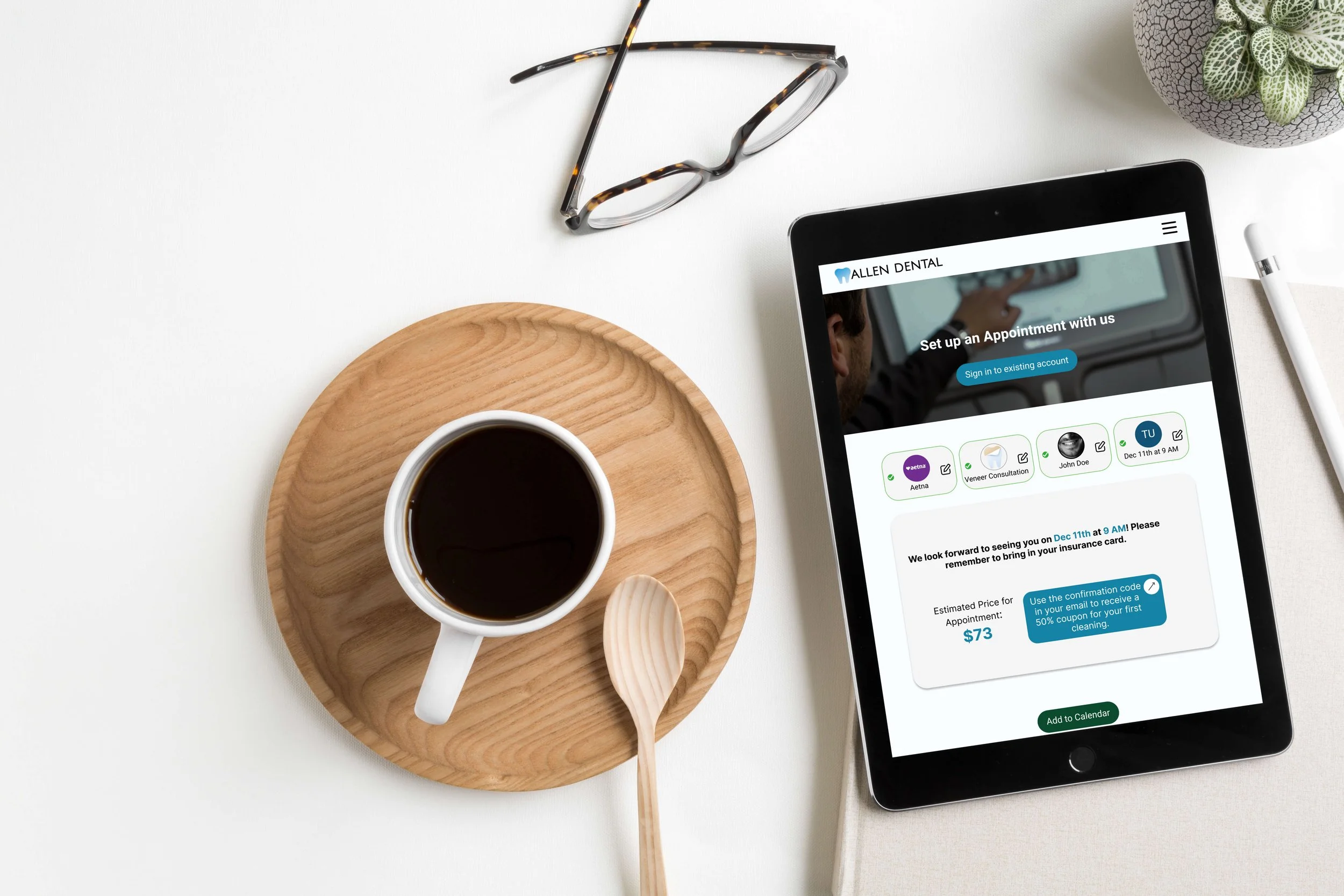
Interactive Scheduling
In just 4 steps, users can schedule an online appointment at Allen Dental. The function is intuitive with an easy-to-use calendar and price estimate at the confirmation stage.
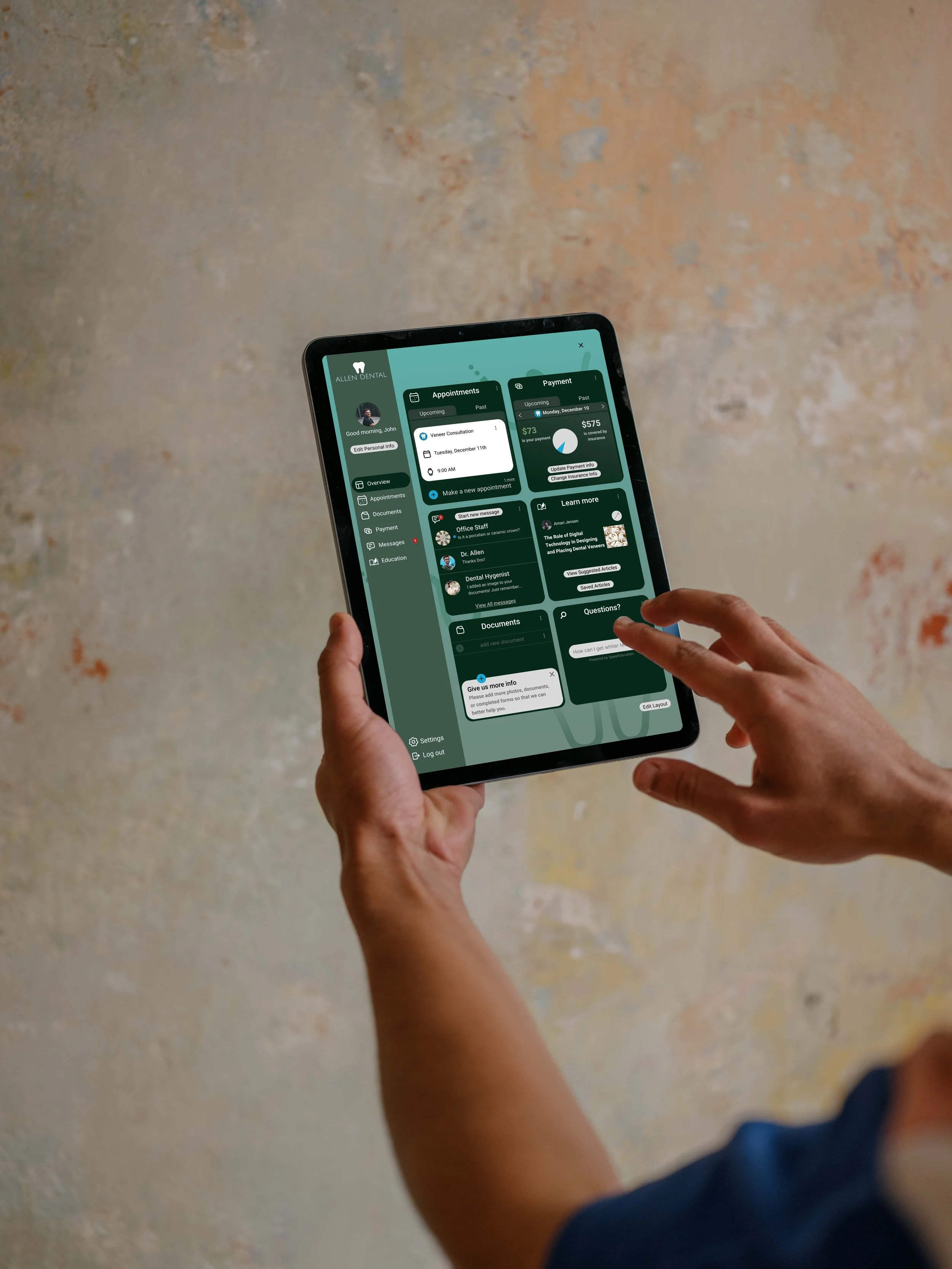
Patient Portal
Users can also sign in to their patient portal to access important such as upcoming appointments, insurance cost, communication with office staff, related dental information, and personal documents and forms.
Live Chat
Users that are in search of information or have scheduling questions or requests not satisfied by the search results or scheduling platform can opt for a chat with a live associate during operating business hours.
Responsive Design
As this the goal of this design was to increase acquisition and loyalty, ensuring that the design be not only a web application and thus accessible anywhere - but also a responsive web application that allowed for ease of use on any kind of device; smartphone, tablet, or desktop.
Start with Search
By incorporating a search monocle in the top navigation menu, I wanted to ensure users ability to quickly access information about their dentist, procedures, services, or general health.
Services & Information
A full list of offered service, deals and promotions, and other various important pieces of information such as accepted insurance companies were important components of this website as detailed throughout the research phase.

Usability Testing
Next, I created a functional prototype in Figma and had participants complete four different tasks; two directly related to the task flow and was conducted on desktop, while the other two were based on other major features meant to confirm the usability of mobile and tablet designs.
User Testing Tasks
Find a service offered by dentist (Desktop)
Schedule an Appointment (Desktop)
Learn about the Doctor (Mobile)
(Onc logged in) Navigate to Dashboard of Account (Tablet)
-
The overall goal was to evaluate the experience of users while completing these specific tasks to help identify pain points within my task flow or design.
-
3 Users were interviewed
1 male, 2 females
all 3 meetings in person
-
Task Completion Rate: 100%
Average number of Errors:
Find a service offered by dentist (Desktop) - 0 Errors
Schedule an Appointment (Desktop) - 0 Errors
Learn about the Doctor (Mobile) - 1 Errors
Navigate to Dashboard of Account (Tablet) - 1 Errors
Average time to complete tasks:
Find a service offered by dentist (Desktop) - 20 sec
Schedule an Appointment (Desktop) - 1 min 15 seconds
Learn about the Doctor (Mobile) - 30 seconds
Navigate to Dashboard of Account (Tablet) - 40 seconds
-
Average overall user Satisfaction: 8.5/10
Noticeable Frustration by users: 2/16 (one user had trouble finding the dentist and dashboard pages)
-
All insights from the User Testing Interviews were compiled into a feedback grid. This helped to better visualize the changes that users want to be made, questions that they had throughout, and ideas that they came up with. This also provided me with positive feedback as to what was working well.
These cards were further organized into four main take-aways, the last three of which are actionable.
The platform is very easy to use and visually appealing.
Shortcuts and elements can be added to make things even easier and less time consuming for users.
Users want more information catered to each task
Updates to the overall design can help users navigate!
Iterations based on Take-Aways from User Testing
An Example of c: add “soonest available time” to date and time picker
Issue
One user commented that updates to the visual design of the scheduler could be updated. Another commented that it could be valuable to include an option for users to quickly pick the soonest available time.
Iteration
To fix this, I reworked the overall design of the date picker from something more traditional to something more interactive. With this design, users could see what was available as soon as they arrive on this screen as opposed to clicking through multiple elements of a date picker.
Conclusion
Was the project successful?
The research done at the beginning of this project produced valuable insight about my target audience and even about the potential features that they found valuable. Organizing these features into a site map and task flow helped me better understand the hierchy of conent which allowed me to built into a lo-fi (and then hifi) wireframes. The hifi wireframe prototype was tested with our target audience to assess usability. Appropriate changes were made based on the feedback. Thus, I deem this product a success.
What can be improved?
There are a number of additions I would make moving forward; before and after completing more user tests. Firstly, I would complete the suggested iterations based on user-testing. This starts with adding more information about the dentist that sets him apart from his competition. Through reviewing the current website and speaking with him, it’s clear that Dr. Allen makes an effort to utilize novel techniques and technology to improve the experience of his clients. I would be sure to include this in the homepage as well as place it in the navigation menu, either as a page by itself or under the “about” tab. This would be determined with user testing.
Through user testing, I also learned that users would prefer a more prominent logo.
Lastly, I leaned that users on desktop valued changes that indicated that they should scroll down on the homepage for more information. For desktop, almost all of the users utilized the navigation menu to visit different pages instead of scrolling up and down on the homepage. When prompted one user suggested that she didn’t know there was more on that page than the hero image and text. With more time, it would be nice to explore a good fix for this; making the height of the hero shorter or including indicators to help users understand that more information is down below.
What did I learn?
“Let the research lead!”
If you look at the above screenshots closely, you’ll notice that, while the date and time picker was the focus of the iteration, the sequence of the feedback cards also changed.
In the first draft of the wireframes, I hypothesized that the most natural process of inputting information for a scheduling page sequence would involve personal information first. Only after completing user testing did I learn that users would prefer to learn whether or not their insurance was accepted before continuing further in the scheduling process. For me, this underscored how important it is to follow the research rather than a personal hypothesis.