Mental Wellness Platform
OM is a web platform that I built to help individuals maintain their mental wellness by suggesting activities and associated locations for their short term or long term wellness goals. Users can search and browse for locations or activities, while they can also learn about their current mood with suggested activities to help them manage. OM is committed to improving the lives of its users no matter their preferred type of wellness activity; there are options for those who wish to find active solutions and for those who wish to find locations that can facilitate leisure activities.
The goal:
create an interactive website that focuses on preventative mental health care.
Roles
User Research
UX/UI Design
Prototyping
Usability Testing
Tools
Figma
FigJam
Optimal Workshop
Project Duration
Jan 29th - March 23rd
100+ hours
RESEARCH & PLANNING
I conducted research to better understand the needs of my target audience, to gain insights that would help form/confirm hypotheses that could later be accepted or rejected based on more research. A Research Plan was created with the following objectives.
The Research Objectives (later used to formulate Interview Questions):
Determine which activities are most popular among users.
Understand the habits of each type of activity
Determine how the needs of a location are different when conducting different activities
Understand how these activities fit into everyday life.
Understand users current pain points with finding meditative locations nearby.
Competitive Analysis and Literature Research
Three different apps were compared for pro’s and con’s. OM’s hypothesized advantages and disadvantages were compared against the advantages and disadvantages of Headspace, Happify, and Moodkit. I was able to identify that while all brand promoted healthy minds through different means, OM was the only brand that would be focusing on external remedies for mental health. Secondary research helped support these findings by showing the expected growth rate for the mental health app market would sit above 15%.
Survey
Since I was targeting mental health conscious individuals, this survey sought to find the most common types of activities conducted. The purpose of these surveys was to gain quick quantitative data to help build persona profiles.
12 people responded to the following question:
What are 5 (or more) Activities that you do to maintain or improve your mental health?
Importantly noted was the fact that the top 5 activities (scoring 4 votes each) included both leisure and more active activities; exercise, reading, pray, journaling, go outside.
User Interviews
Following the competitive analysis and survey, I needed to gain more specific insights; this was done through interviews. Using the Research Objectives from the User Research Plan, I determined what information was a priority within the project and then transformed those research questions into interview questions via an Interview Discussion Guide. Given the different perspectives that different groups of people might have surrounding mental health, I made an effort to interview participants with a wide range of characteristics with the single chosen variable being their professed interest in their mental wellness.
Affinity Map
I chose a simple approach to grouping the affinity map. After outlining all the different statements from interviews, I was able to find patterns between users that found activities that involved movement (like exercising) most helpful and activities that involved little movement (like meditating) most helpful. After analyzing this data further, I was able to make further distinctions between users that found activities with friend vs activities alone most helpful.
Themes:
Moving Activities (with Friends)
Moving Activities (alone)
Still Activities (with friends)
Still Activities (Alone)
POV and HMW Statements
In an effort to prepare for the next phase (brainstorming solutions), I made the attempt to compile the insights I found during this research portion into bite size sentences that would inspire some innovative solutions. I started by transforming the insights into POV statements that aimed to capture the needs, emotions, and motivations. These statements were used to create “how might we” statements. They were then used to create the following Persona Profiles with the goal of becoming better aquatinted with user goals, needs, and habits.
Personas
In dissecting each of the HMW statements for the realistic representations that users would share with regard to behavior, motivations, and goals such as frequency of exercising, mood and outlook on life, or attitude towards sharing their goals and experiences in a community - I created four persona profiles.
Idea Generation
The goal of the Idea Generation Phase was to create big picture solutions to the problems faced by the four personas. I did this in three ways, in this order; a storyboard, Impactful Ideas Activity, following a Project Goal Venn Diagram.
-
Firstly, a Storyboard was created with the intention of visualizing the pain points. Specifically, I was able to see the context that this hypothetical app could present solutions for each persona; Chris can find quiet locations for his devotions, Ed can find great spots to play basketball with his friends, Lindsey can meet likeminded people, and Rebecca can schedule all of her meditative sessions.
-
Ideas were generated for each of the four how might we question by using two different approaches; Analogous Inspiration (comparing features from other apps, websites, or written work such as Yelp, Instagram, and fitness magazines) and Playing with Opposites (thinking of things that would not serve as a solution, and then applying the opposite, one of the most notable being creating no differentiator between highly aerobic activities and more leisure activities.
-
Business and User Goals were also compared against each other along with their accompanying metrics. Goals that were shared by both the business and user were prioritized; such as good ui designs, easy sign up, and filterable search results (which was also confirmed as an important potential feature through the impactful ideas)
Storyboard
Information Architecture
-
Using data from User Interviews, Competitive Analysis, but mainly the survey, a card sort was created to gain more insight into how users would organize content on the site through a site map and filtering.
3 users completed this.
34 Cards were sorted into categories created by the user.
-
A site map was created using the data from the Card Sort and from Competitive Analyses. As suggested from both the Impactful Ideas and Project Venn Diagram of the last phase, the activities were organized into groups that supported “movement” or “downtime”.
-
I translated the user needs and goals gleaned from the hypothesized features of the site map to create an overall user flow that was later narrowed down into 3 task flows that show one of the main features of the website; creating an activity plan.
This phase of the project served to narrow down some of broad ideas generated from the Ideation Phase to create a framework which could be used to begin sketching the actual product. This was done three ways:
Lo-Fi Wireframes
Using the information from my Information Architecture Phase, I narrowed the task flow down to three key features:
Find an location
Log in
(once logged in) Add activity to Calendar
“Progressive Advancement” was the design method chosen to create a responsive design. With Accessibility and Inclusion in the forefront of my mind, my goal was to provide all users (regardless of browser functionality) with a baseline of essential content and functionality which could be built on for more advanced browsers. Therefore, we started by designing all of the screens for Mobile first before beginning to design for Desktop.
UI Kit
Colors, fonts, Icons, and Card Styles of this UI component library were created using the following Brand Values which originated from an deep analysis of the personas as well as consideration of the business/user goal Venn.
Peacefulness
Grounding
Motivation
Nature
Community
Progress
Minimum Viable Product
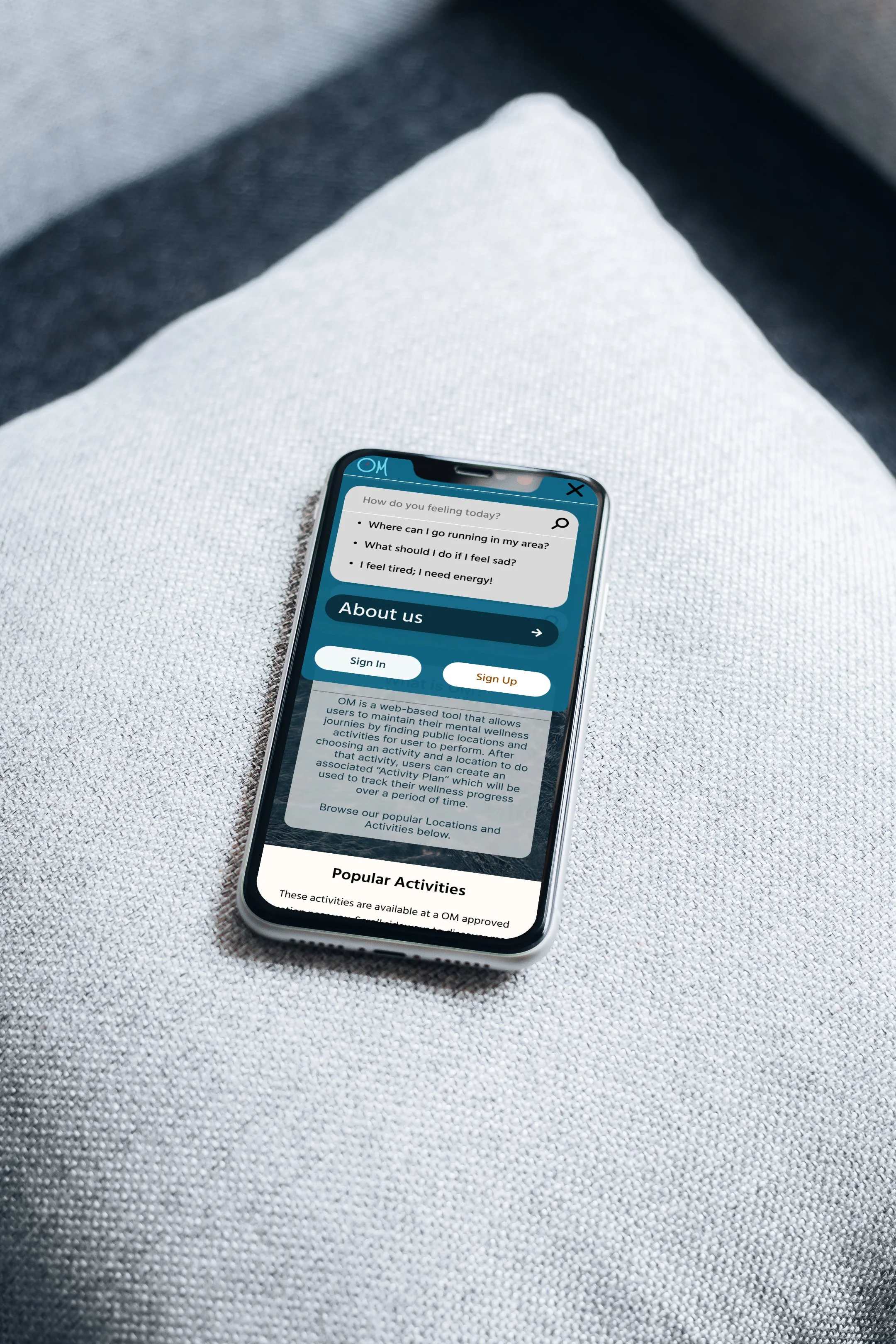
OM is a web-based tool that allows users to maintain their mental wellness journies by finding public locations and activities for user to perform. After choosing an activity and a location to do that activity, users can create an associated “Activity Plan” which will be used to track their wellness progress over a period of time.
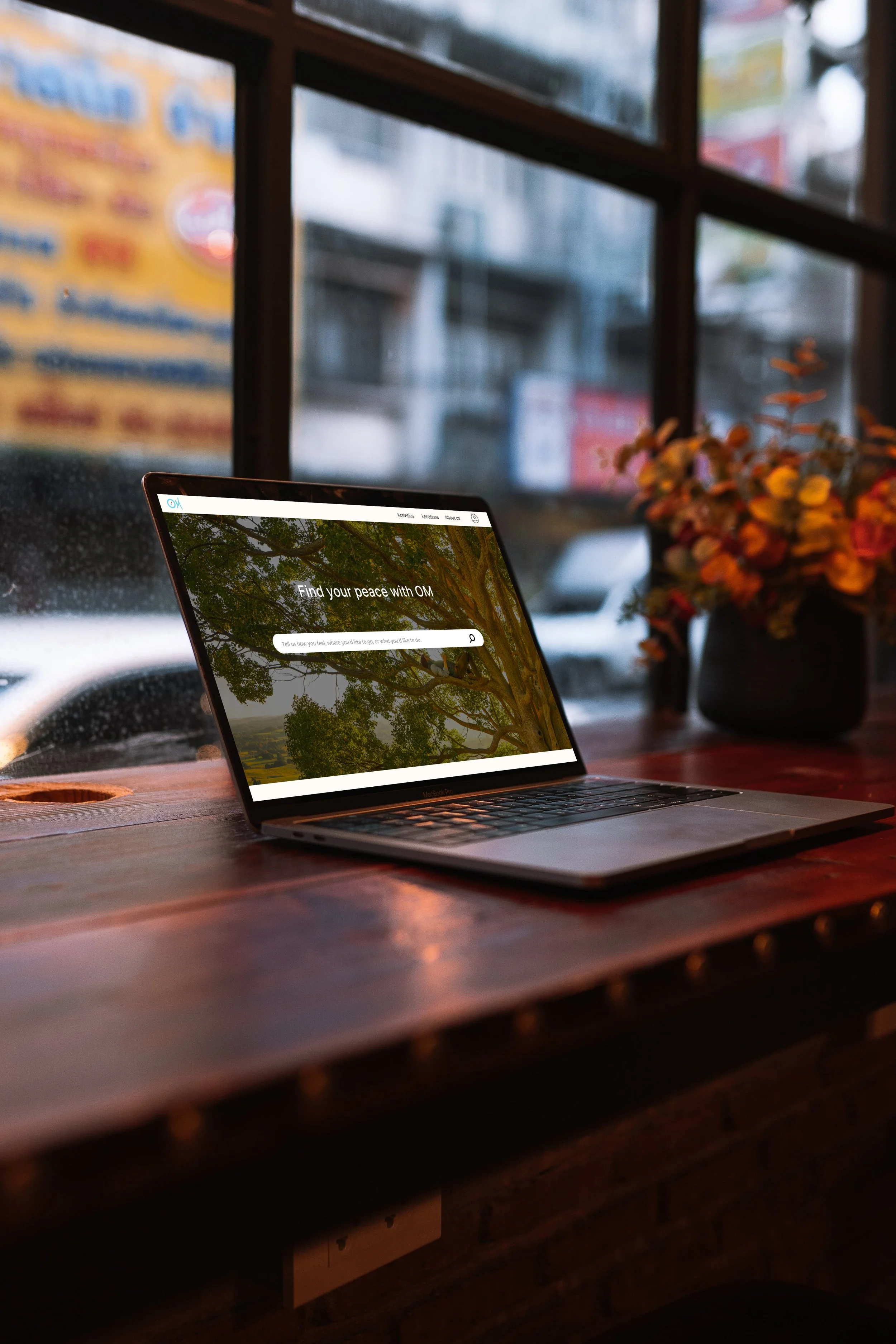
A search bar was outfitted in the Hero of the homepage to allow users to easily search for locations, activities, or to share their current mood for suggestions.
Browse Activities
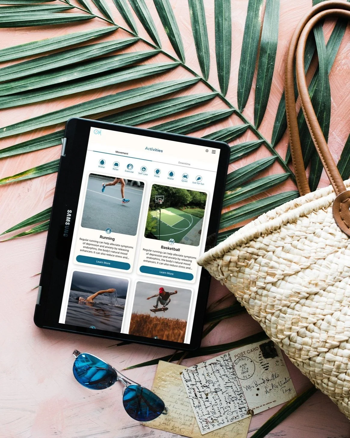
Whether users choose to utilize the search bar to find available activities or click on the activities button in the navigation menu, they will be able to browse through activities and read descriptions of each potential health benefit, or click on the learn more button to access the activities details page.
Start with Search
Browse Locations
If users choose to begin with locations first, they will be able to browse through available locations in their area after searching or clicking the “locations” button in the tab. The browse page will allow them to learn details about the locations, such as address and ratings.
Create a Plan
The focus feature of this project is the prototyped “Create an Activity Plan” concept that allows users to chose locations and activities to participate in along with the option to add the plan to their calendar or share it with friends to maintain accountability.
Educate yourself
Both the Activity and Location details pages will include educational information to allow users a better understanding and potential experience when conducting the activities. Both are outfitted with features, reviews and tips, and suggestions on what to bring based on activity or location.
Access anywhere
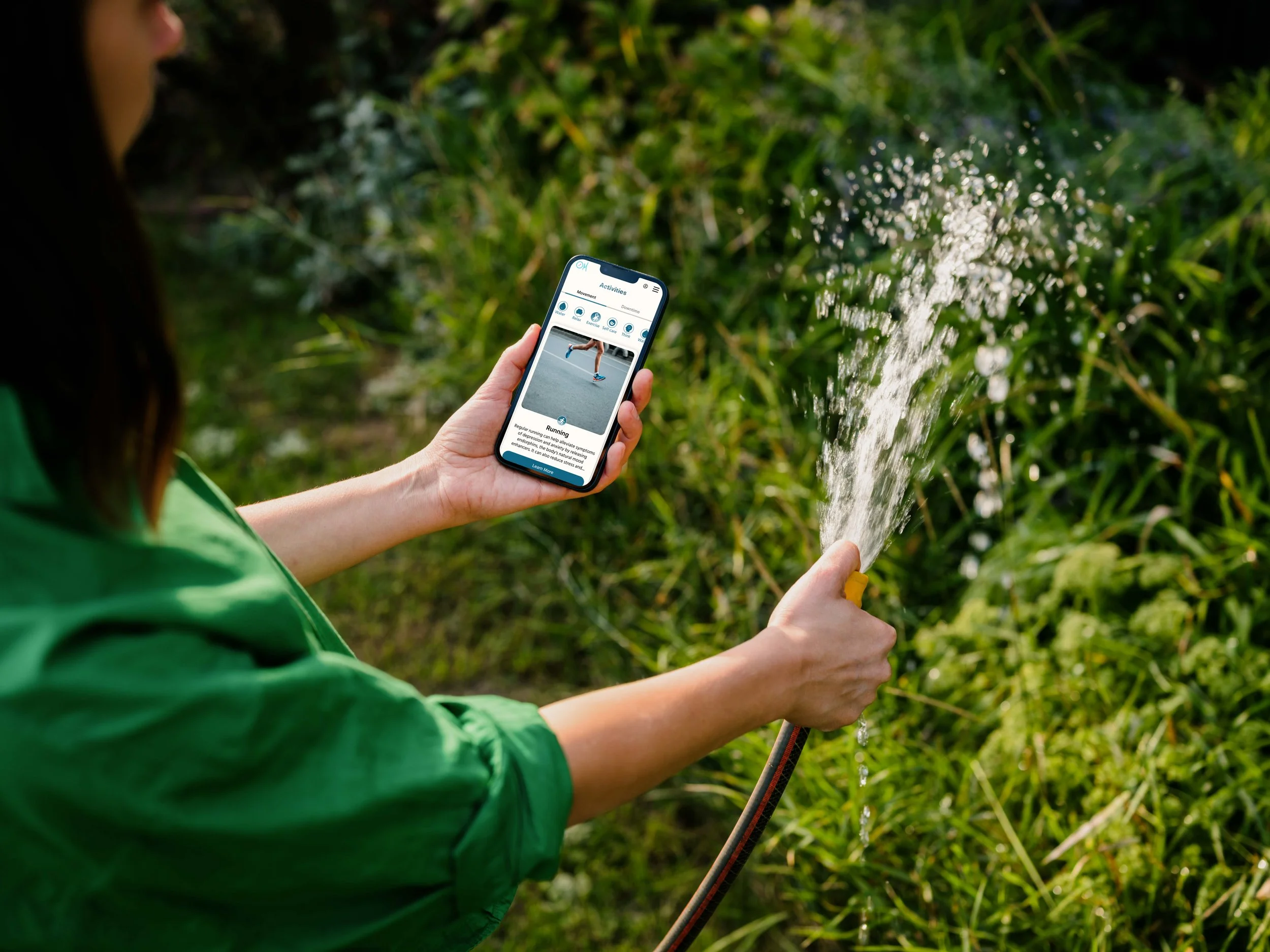
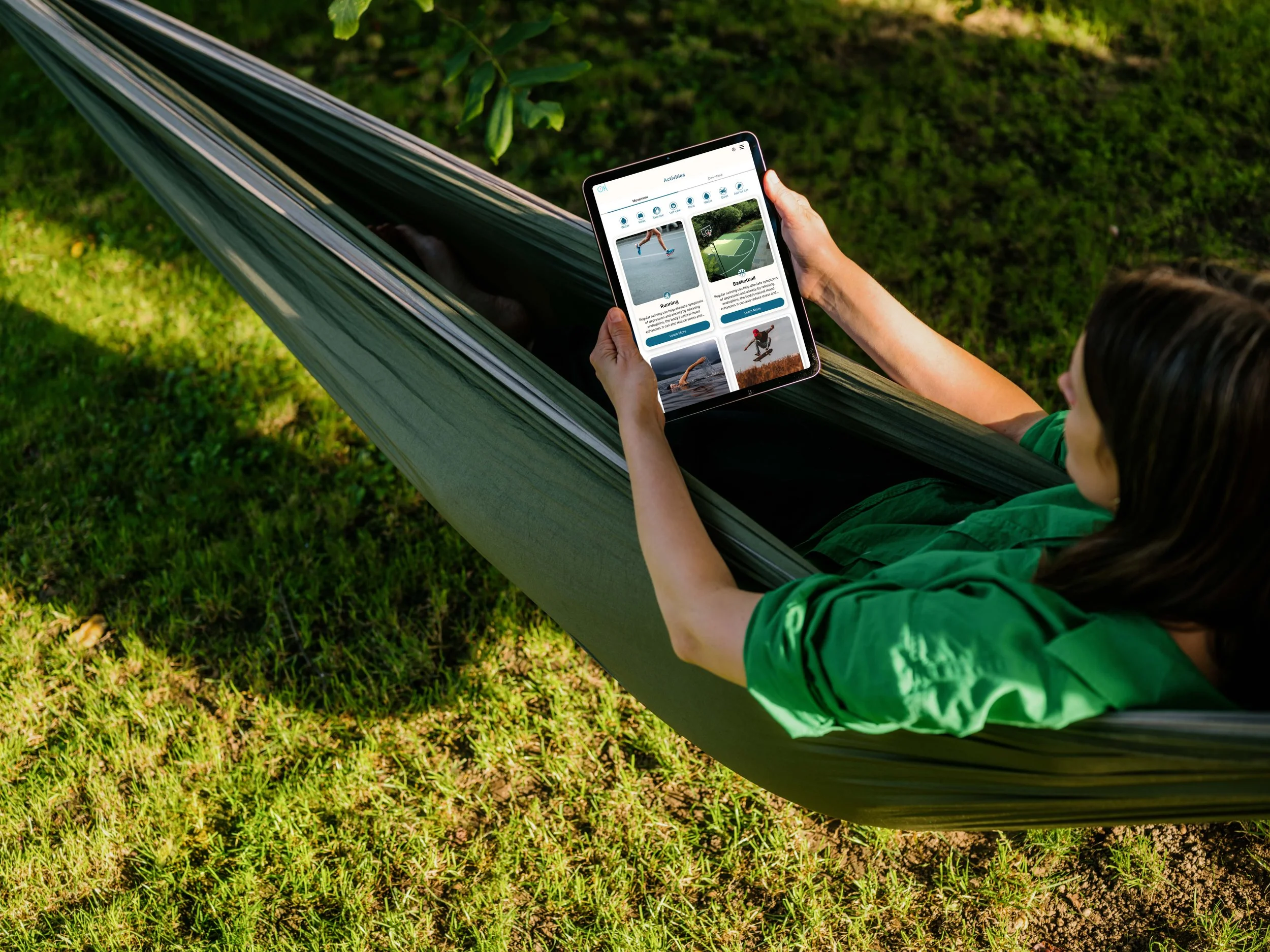
One of the most important features suggested during the research phase was the increased accessibility on various devices. It was important for me to not only create a web based application, but to make that design responsive and thus, accessible from any kind of device; smartphone, tablet, or desktop.
Usability Testing
Usability Testing was completed to assess how the product functioned with the specific tasks that were idenified as being improtant to the target user.
User Testing Tasks:
find a Favorable Location/Activity
Log in
(Once Logged in) create and add an Activity Plan to Calendar.
-
For the Usability Test, I created a functional prototype and had participants complete three different tasks (taken from the User/Task Flow). These three tasks help the user to utilize the feature of the website which would serve to eliminate the pain points of each of the 4 personas and subsequently help them reach their goals.
The overall goal was to evaluate the experience of users while completing each tasks to help identify pain points within my task flow or design and use those data marks to help make changes to improve design.
-
The quantitative metrics were average number of errors per task, average time to complete each task, and the task completion rate, while the qualitative metrics included average overall user satisfaction and noticeable frustration by the user.
5 Users were interviewed
1 male, 4 females
4 meetings in person, 1 virtual
-
All insights from the User Testing Interviews were compiled into a feedback grid. This helped to better visualize the changes that users want to be made, questions that they had throughout, and ideas that they came up with. This also provided me with positive feedback as to what was working well.
These cards were further organized into three main take-aways:
The purpose of the product is not immediately obvious to users.
Visual Design can be updated to be more modern and appealing with differentiated cards
Updates to the site-wide copy can help users navigate more easily.
Iterations based on Take-Away #2:
An Example of 02: More Modern and Appealing Cards + More differentiation among cards
Issue
3 of the 5 participants suggested that visual design could be improved through a number of means. One suggested adjusting the Icons, reworking the shape, size, or effects of cards. The last commented that it looked like an outdated version of facebook.
Iteration
To remedy this, I changed the style of the “active” filter, adjusted the header, and made adjustments to the card such as fitting the icon on the bottom of the image, adding a drop shadow, and adding a button in the place of a text link.
Conclusion
What can be improved?
There are a number of additions I would make moving forward; before and after completing more user tests. Firstly, an educational page to explain each of the different types of moods, why your body reacts in different ways, and how location and activities can have specific physiological changes to ultimately help change your mood. With more time, I would also adjust or remove the logo in the navigation bar from certain pages as it’s cut off. Adding a field for users to enter their location before they begin browsing is also a key feature that was missed.
Was the project a success?
Creating an app that compiles a list of niche locations has been something I’ve seen a need for since the pandemic. Seeing friends make posts from different locations has helped me build a repriotoir of locations for myself.
Following the research on mental health, it became clear to me that this idea (if designed right) could easily empower users by pairing it with mental health activities. The impetus for this website, therefore, was to empower users to take their mental wellness into their own hands by encouraging the real and tangible effect that’s possible from completing their chosen mental health activity at an OM approved location. After considering the metrics received during usability testing, I would call this project a success.
"Stay organized from the start.”
Organization has always been one of my strengths, but this project has forced me to take extra focus in naming elements and components as it will only make things easier and more streamline down the road.

